2017-07-24 19 views
5

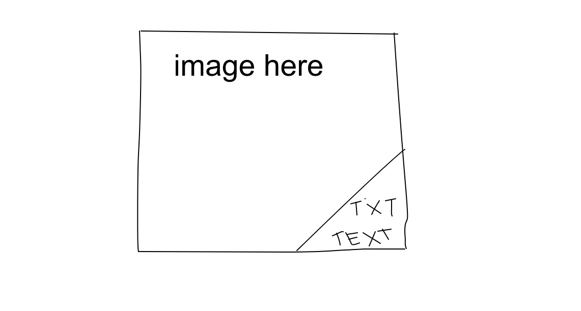
Vì vậy, tôi muốn đặt hình tam giác trên hình ảnh bằng CSS, chính xác là hình tam giác có chứa một số văn bản. Một cái gì đó như thế này:Hình dạng có văn bản trên hình ảnh

https://sketch.io/render/sk-11fa7e2aeba09cb08372f831f84d9af2.jpeg enter image description here

tôi là một chút khó khăn, vì vậy đây là những gì tôi có bây giờ:

.image { 
    background: url('../image.jpg'); 
    background-repeat: no-repeat; 
    background-size: cover; 
    position: relative; 
    overflow: hidden; 

    & .text { 
     position: absolute; 
     background-color: #FFF; 
     bottom: 0; 
     right: 0; 
     padding: 10px 20px; 
    } 
} 

<div class="image"> 
    <span class="text"> 
     <p>Text here</p> 
     <p>And here</p> 
    </span> 
</div> 

Làm thế nào tôi có thể xoay/góc/thu hẹp phía bên trái của cái hộp..?

Cảm ơn bạn rất nhiều vì đã trợ giúp!

Trả lời

2

Bạn có thể sử dụng một yếu tố giả của phụ huynh, rotate() nó, và translateY() nó ở góc dưới bên.

body { 
 
    max-width: 320px; 
 
} 


.image { 
 
    background: url("https://lh3.googleusercontent.com/-QPadFFLbBGA/AAAAAAAAAAI/AAAAAAAADB8/FkNCMP_vkAc/photo.jpg?sz=328"); 
 
    background-repeat: no-repeat; 
 
    background-size: cover; 
 
    position: relative; 
 
    overflow: hidden; 
 
    padding-bottom: 100%; 
 
} 
 
.image .text { 
 
    position: absolute; 
 
    bottom: 0; 
 
    right: 0; 
 
    padding: 10px 20px; 
 
} 
 
.image::before { 
 
    content: ''; 
 
    background: white; 
 
    position: absolute; 
 
    top: 0; 
 
    left: 0; 
 
    bottom: 0; 
 
    right: 0; 
 
    transform: rotate(-45deg) translateY(75%); 
 
}
<div class="image"> 
 
    <span class="text"> 
 
     <p>Text here</p> 
 
     <p>And here</p> 
 
    </span> 
 
</div>

2

Tạo hình tam giác với linear gradient và sử dụng padding topleft để làm cho hình tam giác đủ lớn cho văn bản.

.image { 
 
    width: 200px; 
 
    height: 200px; 
 
    background: url(http://lorempixel.com/200/200/animals/); 
 
    background-repeat: no-repeat; 
 
    background-size: cover; 
 
    position: relative; 
 
    overflow: hidden; 
 
} 


.text { 
 
    position: absolute; 
 
    background: linear-gradient(to bottom right, transparent 50%, white 51%); 
 
    bottom: 0; 
 
    right: 0; 
 
    padding: 60px 0 0 60px; 
 
    text-align: right; 
 
    white-space: nowrap; 
 
}
<div class="image"> 
 
    <span class="text"> 
 
     <p>Text here</p> 
 
     <p>Something longer</p> 
 
    </span> 
 
</div>

+0

giải pháp thú vị ... cảm ơn! Tôi nhận thấy rằng nó trông hơi pixelated (dòng không phải là 100% thẳng và mịn) - là có một workaround mà bạn biết? – Smithy

+0

Cách giải quyết là có khoảng cách nhỏ giữa các điểm dừng màu. –

1

Bạn có thể sử dụng đường biên giới trên .image 's ::before::after thuộc tính để làm cho hình dạng tam giác ở góc dưới bên phải của bạn.

.image { 
 
    height:300px; 
 
    width:300px; 
 
    background-image: url('http://lorempixel.com/300/300/'); 
 
    background-repeat: no-repeat; 
 
    background-size: cover; 
 
    position: relative; 
 
    overflow: hidden; 
 
} 


.image::before, 
 
.image::after { 
 
    content: ''; 
 
    position: absolute; 
 
    bottom: 0; 
 
    right: 0; 
 
    border-color: transparent; 
 
    border-style: solid; 
 
} 


.image::before { 
 
    border-width: 1.5em; 
 
} 


.image::after { 
 
    border-width: 3.35em; /* makes triangle bigger */ 
 
    border-bottom-color: #fff; 
 
    border-right-color: #fff; 
 
} 


.text { 
 
    position:absolute; 
 
    bottom:0; 
 
    right:0; 
 
    z-index:1; 
 
} 


p { 
 
    margin-top: 0px; 
 
    margin-bottom: 0px; 
 
}
<div class="image"> 
 
    <span class="text"> 
 
     <p>Text here</p> 
 
     <p>And here</p> 
 
    </span> 
 
</div>

Các vấn đề liên quan