2013-03-11 41 views
62

enter image description hereCách cung cấp bóng cho Nút

Như bạn có thể thấy trong hình, tôi muốn bóng phía sau Button. Tôi đã tạo Button với các góc tròn. Nhưng vấn đề là tôi không thể tạo ra một cái bóng đằng sau đó Button. Làm thế nào tôi có thể đạt được điều này?

+1

Tham khảo: http://stackoverflow.com/questions/3567312/android-drop-shadow-on-view & http://stackoverflow.com/questions/6563927/how-to-make-shadow- effect-for-abutton-in-android –

Trả lời

98

Sử dụng phương pháp này để có được cái nhìn của bạn mong muốn.
button_selector.xml:

<selector xmlns:android="http://schemas.android.com/apk/res/android"> 
<item> 
    <layer-list> 
     <item android:right="5dp" android:top="5dp"> 
      <shape> 
       <corners android:radius="3dp" /> 
       <solid android:color="#D6D6D6" /> 
      </shape> 
     </item> 
     <item android:bottom="2dp" android:left="2dp"> 
      <shape> 
       <gradient android:angle="270" 
        android:endColor="#E2E2E2" android:startColor="#BABABA" /> 
       <stroke android:width="1dp" android:color="#BABABA" /> 
       <corners android:radius="4dp" /> 
       <padding android:bottom="10dp" android:left="10dp" 
        android:right="10dp" android:top="10dp" /> 
      </shape> 
     </item> 
    </layer-list> 
</item> 

</selector> 

Và trong cách bố trí xml của bạn:

<Button 
    android:background="@drawable/button_selector" 
    ... 
    .. 
/> 
+0

Điều này có vẻ thú vị, nhưng khi tôi cố gắng intellij này không thích nó. Khi tôi xem [doc] (http://developer.android.com/guide/topics/resources/drawable-resource.html#StateList) cho 'mục', nó nói' android: drawable' là ** bắt buộc ** . – JohnnyLambada

+1

đóng thẻ bị thiếu – myforums

+1

Nó không chính xác những gì người hỏi muốn như giải pháp này làm cho đối diện: nền nút gradient và bóng màu rắn. Và điều này có vẻ rất khác với bóng bên ngoài –

2

Hãy thử điều này nếu làm việc này cho bạn

enter image description here

android:background="@drawable/drop_shadow" 
     android:layout_width="wrap_content" 
     android:layout_height="wrap_content" 
     android:paddingLeft="3dp" 
     android:paddingTop="3dp" 
     android:paddingRight="4dp" 
     android:paddingBottom="5dp" 
39

Đối với Android phiên bản 5.0 & trên

thử Elevation cho quan điểm khác ..

android:elevation="10dp" 

Đối với Buttons,

android:stateListAnimator="@anim/button_state_list_animator" 

button_state_list_animator.xml - https://android.googlesource.com/platform/frameworks/base/+/master/core/res/res/anim/button_state_list_anim_material.xml

dưới phiên bản 5.0,

Đối với tất cả các quan điểm,

android:background="@android:drawable/dialog_holo_light_frame" 

đầu ra của tôi:

enter image description here

+0

Tôi muốn sử dụng cách tiếp cận này, nhưng các nút của tôi được tạo động (tức là trong mã) trong điều khiển lưới, chứ không phải khai báo (thực ra, tôi đang sử dụng phiên bản miễn phí Xamarin, vì vậy là Mono lib). Dường như không phải là một phương pháp đơn giản để chỉ đặt bất kỳ thuộc tính nào. – jrichview

+0

@jrichview xem câu trả lời này và cũng bình luận http://stackoverflow.com/a/24459128/3879847 –

11

Nếu bạn đang nhắm mục tiêu các thiết bị Lollipop trước, bạn có thể sử dụng Shadow-Layout, vì nó dễ dàng và bạn có thể sử dụng nó trong loại khác nhau của bố cục.


Thêm shadow-bố trí để Gradle bạn nộp:

dependencies { 
    compile 'com.github.dmytrodanylyk.shadow-layout:library:1.0.1' 
} 


Ở phía trên bố trí xml, nơi bạn có nút bấm của bạn, thêm vào đầu:

xmlns:app="http://schemas.android.com/apk/res-auto" 

nó sẽ cung cấp các thuộc tính tùy chỉnh.


Sau đó, bạn đặt một bố trí bóng xung quanh bạn Nút:

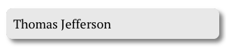
<com.dd.ShadowLayout 
     android:layout_marginTop="16dp" 
     android:layout_width="wrap_content" 
     android:layout_height="wrap_content" 
     app:sl_shadowRadius="4dp" 
     app:sl_shadowColor="#AA000000" 
     app:sl_dx="0dp" 
     app:sl_dy="0dp" 
     app:sl_cornerRadius="56dp"> 

     <YourButton 
      .... /> 

</com.dd.ShadowLayout> 

Sau đó bạn có thể tinh chỉnh các thiết lập để phù hợp với app: bóng cần thiết của bạn.

Hy vọng điều đó sẽ hữu ích.

+1

Nó hoạt động hoàn hảo, nhờ bạn tôi. – oguzhan

+0

lib kém, không còn được hỗ trợ nữa. Bên cạnh đó, nó có vẻ như nó chỉ cho phép bóng tối/đen, không phải là ánh sáng. – forsberg

6

Tôi đã thử mã từ phía trên và tạo bóng của riêng mình, hơi gần hơn với những gì tôi đang cố gắng đạt được. Có lẽ nó cũng sẽ giúp người khác.

<selector xmlns:android="http://schemas.android.com/apk/res/android"> 
    <item> 
     <layer-list> 
      <item android:left="5dp" android:top="5dp"> 
       <shape> 
        <corners android:radius="3dp" /> 
        <gradient 
         android:angle="315" 
         android:endColor="@android:color/transparent" 
         android:startColor="@android:color/black" 
         android:type="radial" 
         android:centerX="0.55" 
         android:centerY="0" 
         android:gradientRadius="300"/> 
        <padding android:bottom="1dp" android:left="0dp" android:right="3dp" android:top="0dp" /> 
       </shape> 
      </item> 
      <item android:bottom="2dp" android:left="3dp"> 
       <shape> 
        <corners android:radius="1dp" /> 
        <solid android:color="@color/colorPrimary" /> 


       </shape> 
      </item> 
     </layer-list> 
    </item> 

</selector> 
+0

Thực ra đó là giải pháp tốt hơn, thx. – forsberg

8

Đây là nút của tôi với bóngcw_button_shadow.xmldướidrawablethư mục

<?xml version="1.0" encoding="utf-8"?> 
<selector xmlns:android="http://schemas.android.com/apk/res/android"> 
    <item android:state_pressed="false"> 
     <layer-list> 
      <!-- SHADOW --> 
      <item> 
       <shape> 
        <solid android:color="@color/red_400"/> 
        <!-- alttan gölge --> 
        <corners android:radius="19dp"/> 
       </shape> 
      </item> 
      <!-- BUTTON alttan gölge 
       android:right="5px" to make it round--> 
      <item 
       android:bottom="5px" 
       > 
       <shape> 
        <padding android:bottom="5dp"/> 
        <gradient 
         android:startColor="#1c4985" 
         android:endColor="#163969" 
         android:angle="270" /> 
        <corners 
         android:radius="19dp"/> 
        <padding 
         android:left="10dp" 
         android:top="10dp" 
         android:right="5dp" 
         android:bottom="10dp"/> 
       </shape> 
      </item> 
     </layer-list> 
    </item> 

    <item android:state_pressed="true"> 
     <layer-list> 
      <!-- SHADOW --> 
      <item> 
       <shape> 
        <solid android:color="#102746"/> 
        <corners android:radius="19dp"/> 

       </shape> 
      </item> 
      <!-- BUTTON --> 
      <item android:bottom="5px"> 
       <shape> 
        <padding android:bottom="5dp"/> 
        <gradient 
         android:startColor="#1c4985" 
         android:endColor="#163969" 
         android:angle="270" /> 
        <corners 
         android:radius="19dp"/> 
        <padding 
         android:left="10dp" 
         android:top="10dp" 
         android:right="5dp" 
         android:bottom="10dp"/> 
       </shape> 
      </item> 
     </layer-list> 
    </item> 
</selector> 

Làm thế nào để sử dụng. trong nút xml, bạn có thể thay đổi kích thước chiều cao và cân nặng của bạn

<Button 
       android:text="+ add friends" 
       android:layout_width="120dp" 
       android:layout_height="40dp" 
       android:background="@drawable/cw_button_shadow" /> 

enter image description here

1

Bạn có thể thử này:

<?xml version="1.0" encoding="utf-8"?> 
<selector xmlns:android="http://schemas.android.com/apk/res/android"> 
<item android:state_pressed="true"> 
<layer-list> 
     <item android:left="1dp" android:top="3dp"> 
      <shape> 
       <solid android:color="#a5040d" /> 
       <corners android:radius="3dip"/> 
      </shape> 
     </item> 
    </layer-list> 
    </item> 
<item> 
    <layer-list> 
     <item android:left="0dp" android:top="0dp"> 
      <shape> 
        <solid android:color="#99080d" /> 
       <corners android:radius="3dip"/> 
      </shape> 
     </item> 
     <item android:bottom="3dp" android:right="2dp"> 
      <shape> 
       <solid android:color="#a5040d" /> 
       <corners android:radius="3dip"/> 
      </shape> 
     </item> 
    </layer-list> 
</item> 

0

Sample 9 patch image with shadow

Sau một rất nhiều nghiên cứu Tôi đã tìm thấy một phương pháp dễ dàng.

Tạo hình ảnh bản vá 9 và áp dụng nó làm nút hoặc bất kỳ nền nào khác của chế độ xem.

Bạn có thể tạo hình ảnh bản vá 9 có bóng bằng cách sử dụng website này.

Đặt hình ảnh bản vá 9 trong thư mục drawable của bạn và áp dụng nó làm nền cho nút.

mButton.setBackground(ContextCompat.getDrawable(mContext, R.drawable.your_9_patch_image); 
Các vấn đề liên quan