8
Tôi đang cố gắng đặt góc của div hình vuông màu xanh dưới div màu da cam. Tôi đã thử tất cả mọi thứ tôi biết: z-index không hoạt động vì div của tôi được gói trong div khác, và nếu tôi mở nó, tôi sẽ gặp rắc rối với việc định vị tám phần tử.Xếp chồng một góc của một div bên dưới một div
Ai đó có thể cho tôi biết cách thực hiện việc này không? Hoặc làm thế nào để sử dụng z-index cho tất cả các yếu tố?
Những gì tôi có:
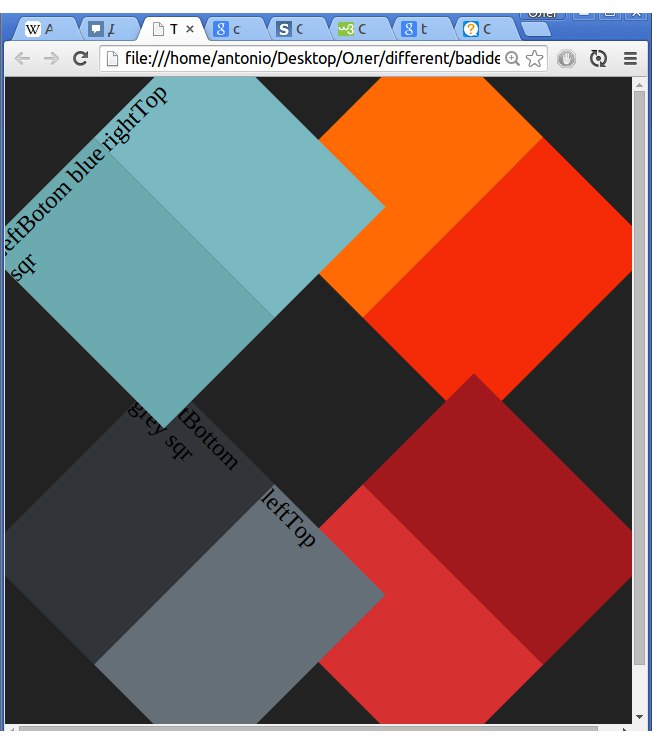
Những gì tôi cần:

HTML của tôi cho đến nay:
body {

    background-color: #222;

    background-repeat: no-repeat;

}

#blueSquare {

    position: absolute;

    left: 15px;

    top: 15px;

    width: 50%;

    height: 170px;

    -webkit-transform: rotate(-45deg);

}

#rightTopblueSquare {

    height: 100%;

    width: 50%;

    position: relative;

    left: 50%;

    background-color: #7ab9c2;

    opacity: .99;

}

#leftBottomblueSquare {

    position: relative;

    top: -100%;

    height: 100%;

    width: 50%;

    background-color: #6baaae;

}

/*----------------------------------*/

#greySquare {

    width: 50%;

    height: 170px;

    position: absolute;

    bottom: 15px;

    left: 15px;

    -webkit-transform: rotate(45deg);

}

#lefTopgreySquare {

    height: 100%;

    width: 50%;

    position: relative;

    left: 50%;

    background-color: #656f78;

}

#rightButtomgreySquare {

    position: relative;

    top: -100%;

    height: 100%;

    width: 50%;

    background-color: #313439;

}

/*----------------------------------*/

#redSquare {

    width: 50%;

    height: 170px;

    position: absolute;

    right: 15px;

    bottom: 15px;

    -webkit-transform: rotate(-45deg);

}

#leftBottomredSquare {

    height: 100%;

    width: 50%;

    position: relative;

    left: 50%;

    background-color: #a2191d;

}

#rightTopredSquare {

    position: relative;

    top: -100%;

    height: 100%;

    width: 50%;

    background-color: #d63030;

}

/*----------------------------------*/

#orangeSquare {

    width: 50%;

    height: 170px;

    position: absolute;

    right: 15px;

    top: 15px;

    -webkit-transform: rotate(45deg);

    z-index: -1;

}

#rightBottomorangeSquare {

    height: 100%;

    width: 50%;

    position: relative;

    left: 50%;

    background-color: #f42b06;

}

#lefttToporangeSquare {

    position: relative;

    top: -100%;

    height: 100%;

    width: 50%;

    background-color: #ff6a05;

    opacity: 1;

}
<div id="orangeSquare">
<div id="rightBottomorangeSquare"></div>
<div id="lefttToporangeSquare"></div>
</div>
<div id="redSquare">
<div id="leftBottomredSquare"></div>
<div id="rightTopredSquare"></div>
</div>
<div id="greySquare">
<div id="lefTopgreySquare">leftTop</div>
<div id="rightButtomgreySquare">rightBottom grey sqr</div>
</div>
<div id="blueSquare">
<div id="rightTopblueSquare">rightTop</div>
<div id="leftBottomblueSquare">LeftBotom blue sqr</div>
</div>
Điều bạn cần không chỉ thay đổi chỉ mục z, những gì bạn cần là chuyển đổi 3D thực sự. http://www.w3schools.com/css/css3_3dtransforms.asp – abimelex
đã thử, cả div z-index: 1; và div đó vị trí cao hơn được trên đầu trang, không có vấn đề làm thế nào để bạn quay nó trong tất cả 3 dimentions X Y Z –